
Wefeen Guides
Best Digital Wedding Invitation Designs
Direct answer
The best digital wedding invitation design is the one a guest can read on a phone in about ten seconds: names, date, venue, and what to do next. On Wefeen you can buy Golden Secret or Petal Promise as a Save the Date, and The Sacred Garden as a Template with RSVP. Open the live demos on a real phone. Screenshots hide type size and how long the opening takes.
What “best” usually means (and shouldn’t)
When a couple asks me for the best digital wedding invitation design, they almost always mean the one that looked expensive in a screenshot. That’s how you end up with a gorgeous cover and a start time nobody can find. I sat at a kitchen table in Croydon while a mother-in-law pinched her phone and said, very politely, that she couldn’t see when to arrive. The design had won every mood board in the group chat. She still didn’t know if she needed a taxi at five or at seven.
A digital invitation has to work on a bus, in a shop queue, in a bright courtyard, on a cracked Android that still runs WhatsApp. The design I call best is the one that still behaves like an invitation after that: names, date, venue, and a next step. If you’re collecting replies, the RSVP has to be obvious. If you’re only holding the date, don’t dress the page like a full suite and then wonder why people try to answer dinners in November.
Wefeen isn’t a thousand-template marketplace. Too many looks become a second job. You currently buy from a short live list: Golden Secret and Petal Promise as Save the Dates, The Sacred Garden as a Template Invitation. Preview them as websites, not as thumbnails. Then decide. If you still need the definition of the medium, start with what a digital wedding invitation is. If you need the checklist of facts, use what to include. This page is about how that link looks once someone opens it.
If you can’t read the hour aloud to a taxi driver, keep working. A pretty cover does not finish the job.
How to judge a design on a phone
Sit down with the oldest phone in the house. Not your new one. Open the demo on mobile data, not only hotel Wi-Fi. Turn the brightness down to what a restaurant actually feels like. Then time yourself. In ten seconds, can you say the couple’s names, the date, and the city? If you’re on a Template, can you see how to reply without hunting? If the opening animation is still playing at second eight and the facts aren’t visible, the opening is too proud of itself.
Check contrast. Gold on cream can be elegant and also disappear outdoors. Thin script can be romantic and also unreadable to anyone over forty. Dark type on a quiet field still wins more guest lists than a texture that photographs well and fails in daylight. I’m not giving a taste lecture. I’m telling you how people RSVP: one-handed, slightly impatient, a little suspicious of unknown links.
Watch what a guest has to do. They shouldn’t install anything. They shouldn’t create a password. They tap a normal HTTPS link. That rule is bigger than typography, see do guests need an app, but design can still sabotage it. A cover that looks like an app-store ad trains people to hunt for a download. A page that looks like a letter trains people to read. I know which one I want for Uncle Suresh.
Check sharing. WhatsApp will compress a video and often show a preview of a link. Your share page is what the chat preview draws from. A design that only works as a four-minute file isn’t a WhatsApp invitation. It’s a film you can’t update. Send a link. The method is in WhatsApp wedding invitations. Design is what they see after they trust the tap.
Check paper if you’re hybrid. A QR on a small card has to open this same page, not a second “mobile version.” Print contrast and module size belong in QR code wedding invitations. The design job on the phone is still readable type, obvious facts, one URL.
I once watched a couple approve a design on a 27-inch monitor at midnight and send it the next morning. By lunch, three aunts had screenshotted the cover and asked what time the mehndi started. The time was on the page. It was just under a poem in 11-point script. We enlarged the hour, shortened the poem, and the questions stopped. The design didn’t get “worse.” It got usable.
Designs you can buy today
This collection is the live catalog, not a graveyard of retired looks. If a name isn’t on create, don’t assume you can check out with it. Prices are a one-time page: Save the Date is currently $48, Template Invitation $78. The money breakdown is in digital wedding invitation cost. What follows is how each live look behaves.
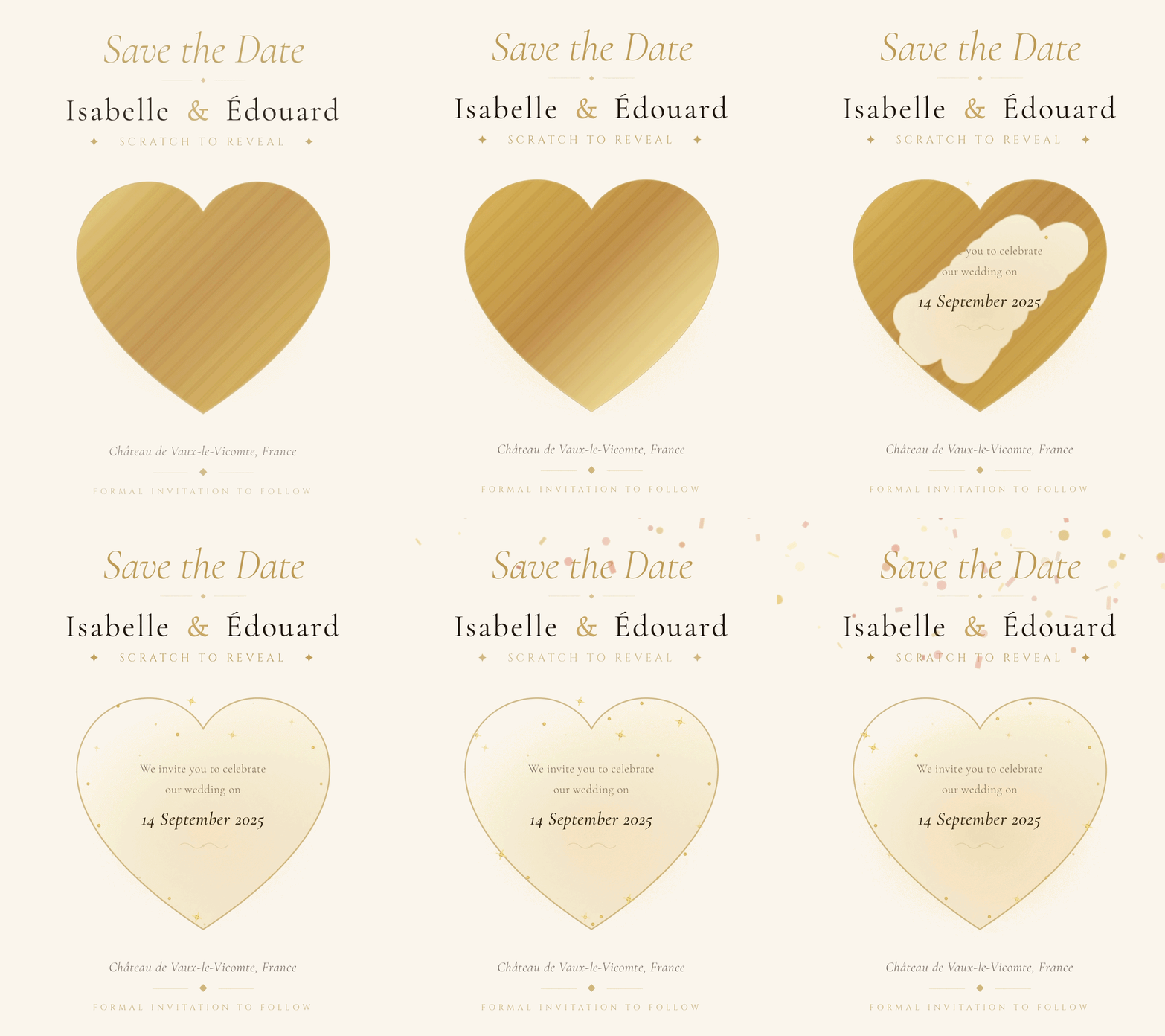
Golden Secret
Save the Date · Scratch the golden heart to reveal your date.
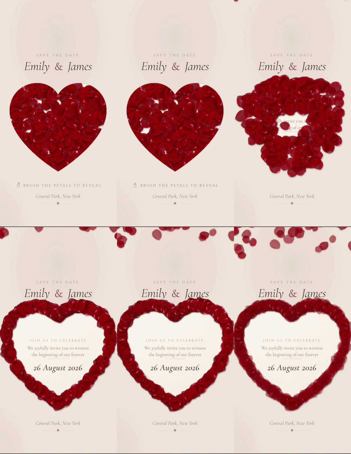
Petal Promise
Save the Date · Brush rose petals from the heart to reveal your date.
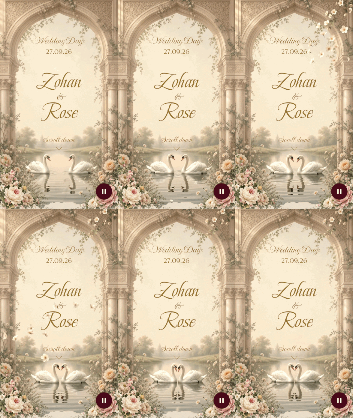
The Sacred Garden
Template Invitation · Soft florals, golden elegance, and a full invitation with RSVP.
Open each card. Don’t rank them like a shopping blog. Rank them against your room: garden, city hall, coastal, gold, quiet. A coastal wedding in a gold-scratch Save the Date can still be right if the type is clear. A garden wedding in Sacred Garden is an easy match and still fails if you hide the venue under poetry. Match the celebration. Then test the phone.
The Sacred Garden, the full invitation
Sacred Garden is a floral Template with a quiet gold, not a loud motion toy. Guests arrive through an opening moment, then they should find date, venue, and welcome without a scavenger hunt. RSVP lives on the page: attending, maybe, declined, party size, optional notes. Two story sections are included. After you publish, the share page gives you the link, a WhatsApp preview, and a QR. That’s why this is the one I tell people to preview first if they need replies.
The garden Template already has a live clock. Don’t buy a second one unless you’ve changed designs. A song is extra. A third story block is extra. A second language is extra. Couples treat a pretty garden as a promise of every add-on. It isn’t. You can send the invitation without music and without a third essay.
It fits garden, estate, greenhouse, and a lot of South Asian daytime celebrations where flowers already belong in the room. Formal enough for parents who wanted paper. Soft enough that a phone screen doesn’t feel like a nightclub flyer. It doesn’t fit a joke-first invite, or a Save the Date only. If you’re not ready for RSVP, buy a Save the Date design instead. Sacred Garden will look like you forgot the reply card if you leave the form empty and hope people “just know.”
Write into it like a host. Short welcome. Date with a clock a human can say. Venue with a map guests can use. Story sections only if they help, how you met is optional; how to arrive is not. The RSVP guide will keep the form short. The wording guide will keep the first screen from turning into a poem. Sacred Garden won’t save you from a 900-word opening paragraph. It will make a short one feel like a letter.
I sent Sacred Garden to my own sister-in-law last year as a “just look” demo. She RSVP’d on the demo by accident and then texted, embarrassed. That’s how obvious the form is. We laughed. Then I told the couple: if your real guests can do that on the first try, you picked well.
Golden Secret, a Save the Date with a reveal
Golden Secret is play with a purpose. Guests scratch a golden heart and the date appears. That motion is the memory. The information still has to sit where a guest who won’t play can find it. I’ve watched uncles refuse to scratch anything. They’ll read a line of type. Put names, date, and city where those guests can see them without completing the gesture. The reveal is a gift, not a gate.
This is a hold notice. Price and package sit with Save the Date, currently $48. You get the interactive page, the link, the QR after publish, unlimited guests, one language, edits until the event. You don’t get a reply list. If you need dinners, you’re not looking at the right object. Come back to Sacred Garden when the guest list is ready to answer.
It fits evening gold, formal hotels, anyone who likes a little ceremony on a screen without sending a video file. It doesn’t fit a guest list that will be angry at “games,” or a couple who wants the full schedule on day one. You can still be warm in the WhatsApp note: name yourself, name the date in plain text, then the link. People who skip the scratch still know they’re invited to hold a Saturday.
Countdown isn’t a promise on this design. If you want a clock, it’s extra. Music is extra. Don’t tell the family group there will be a soundtrack unless you paid for one. Same rule as paper: don’t print a promise the object doesn’t keep.
A hotel wedding in Mayfair used Golden Secret as the early hold and mailed twelve small cards to the parents’ oldest friends. The cards had the date in type and a QR. Half the elders never scratched the heart. They still held the Saturday. That’s the test. Play is optional. Information isn’t.
Petal Promise, a Save the Date with a softer reveal
Petal Promise is the sister gesture: guests brush petals aside and the date comes through. It reads softer than gold foil. It still has to obey the same information rule. A guest who won’t interact must still leave knowing the day and the city. Put the facts where thumbs can find them. Let the petals be delight, not a lock.
Same package as Golden Secret. Same price class. Same “this isn’t the RSVP suite” boundary. Choose between them with your eyes and your room, not with a blog ranking. Gold for candlelight and black-tie-adjacent. Petals for gardens, daytime, and anyone who already knows they want rose rather than metal. Both fail if you hide the year in a texture.
I tell couples to send both demos to one honest relative and ask a single question: “Can you tell me the date without me coaching you?” If they hesitate, the type is too shy or the reveal is too long. Fix that before you pay. After you pay you can still edit copy until the event. You can’t easily undo a first impression that the invite was a puzzle.
A garden lunch in Surrey picked Petal Promise and then wrote the city in 9-point type under a wash of pink. Beautiful. Useless outdoors. We darkened the type, kept the petals, and the same relative who had hesitated texted the date back in twelve seconds. That’s the quality check I trust. Not a ranking. A relative.
Opening motion versus the facts
Openings are why people hire a live page instead of a PDF. A PDF doesn’t arrive. A page can. The risk is that the arrival becomes the product. Guests wait, smile, and still can’t say where to park. My rule after a lot of these: if the opening takes longer than a deep breath, the facts must already be available underneath or immediately after. Nobody should have to replay an animation to confirm Saturday.
Sacred Garden’s opening is a greeting. Golden Secret and Petal Promise’s reveals are a moment around the date. All three are honest if you write like a host. They become dishonest if you treat motion as content. Music, if you add it, shouldn’t startle someone in a quiet office. Offer a way to understand the invitation with sound off. Most guests will have sound off.
Updates don’t require a new design. If the hall number changes, you edit the live page. Guests keep the URL. That habit is update after sending. A new design after people have already opened the first one is a different decision. Do it only if the old look was wrong for the wedding, and tell people the link is the same. Don’t send a second “new theme” file into WhatsApp as if the first invite were cancelled.
I like motion. I like a scratch. I like petals. I like them the way I like a wax seal on paper: as a hello, not as the only way to learn the hour. If your opening is longer than your venue line, flip that. Guests will forgive a simple open. They won’t forgive a hidden Saturday.
Demos versus checkout
Public demos exist so you can feel a finished guest view without paying. Sacred Garden, Golden Secret, and Petal Promise have public demo URLs. You may also find other /i/demo-* pages, older looks, experiments, a coastal sample. Those pages aren’t a shop shelf. If a name is missing from create, you can’t buy it today. Listing retired names as a collection is how hosts get angry at checkout.
Never print a QR that opens a demo. Never send a demo URL as the official invite. Demos are labeled as product examples, not as your wedding. Your published page is what guests should bookmark. The QR on your share page encodes that published address. Paper hybrids depend on that discipline. One scan, your facts, your RSVP if you bought a Template.
Invitation-only weddings are private. Guest pages aren’t something you stuff with Event markup so Google can announce the marriage. Design for the people you invited. Indexing is a marketing-site job. Your couple page is a letter. Keep it that way.
A print shop in Queens once encoded a demo slug because the couple sent them the “example link” from email. Two hundred cards opened a garden that wasn’t theirs. We caught it on the proof, barely. Publish first. Encode your slug. Then print. That order is boring and it saves a reprint.
Paper, Canva, and hybrids
Paper still wins as an object some people want in a drawer. Digital wins as the page everyone should reopen. The calm hybrid is a short printed card plus this live design underneath a QR. Don’t print the entire Sacred Garden scroll on card stock. Print names, date, city, and a code that opens the page. Comparison of the two media is in digital vs paper. Design taste doesn’t settle that argument. Guest care does.
Canva will give you more stylistic range than three live looks. It will not give you a page you can correct without exporting again. If you love a Canva composition, use it as a teaser or a printed face, and keep RSVP on the live invitation. Canva and RSVP is the longer split. “Best design” on Canva is often “best rectangle.” Best design on a live page is the path a rushed uncle can finish.
Platform lists that rank twenty websites by template count are shopping, not hosting advice. If you need that comparison, use platforms compared. Come back here when you’re choosing among looks you can actually send this month.
I still keep a drawer of leftover foil samples from jobs that looked stunning in a flat-lay and failed in a dim hallway. Digital has the same trap, just with motion instead of foil. Test in the light your guests will actually have. A bride in Bristol once approved Sacred Garden at noon on a patio and hated it at 9 p.m. on the sofa. The type was fine. The gold just vanished against the evening screen brightness. We darkened the welcome line. Same design. Different Tuesday. That is the check I want you to run before you fall in love with a crop from Instagram.
How to choose without getting bored of it
Two months later is the test. The novelty of the scratch or the petals is gone. Relatives are reopening the link for the parking note. If the type is still kind, you chose well. If you picked a look you only loved in a dark Instagram crop, you’ll be tired of it and afraid to send reminders. Pick the design you can stand to see again while you’re also tired of seating charts.
- Decide the job. Hold the date, or collect replies. Save the Date designs are Golden Secret and Petal Promise. Template is Sacred Garden.
- Open the matching demo on the oldest phone. Ten seconds. Names, date, city. RSVP if it is a Template.
- Send that demo to one skeptical relative. Ask them to reply with the date only. No coaching.
- Write the first screen before you buy extras. Music and extra sections don’t rescue a muddy hour.
- Pay on create. Publish when the facts are true. Share one link. Edit in place when the room changes.
Indian multi-event months and destination weekends don’t need a different definition of beauty. They need a page that can carry more than one when-and-where without turning into a brochure nobody finishes. Extra sections exist for that. A second language exists for that. Neither is a new template. See Indian wedding digital invitations and destination invitations for the content habit. Keep the design quiet enough that a schedule can breathe.
Start at create when you are ready to buy. Stay on Sacred Garden until you can recite the facts with the sound off. That is the test guests actually sit: a Tuesday, a bus, no sound, and nobody to ask what time it starts.
Frequently asked questions
Which digital wedding invitation design is best?
The one a guest can read on a phone without pinching: names, date, venue, and RSVP if you are collecting replies. Pretty type that hides the hour is a bad invitation.
What designs can I buy on Wefeen right now?
On /create: Golden Secret and Petal Promise for Save the Date, and The Sacred Garden for Template Invitation. Other /i/demo-* pages may exist for looking. They are not a checkout promise.
Does every design include music and a countdown?
No. Music is extra. Countdown is included on The Sacred Garden; on other designs it is extra. Write the start time either way.
Can guests see the design without an app?
Yes. They open a normal HTTPS link in Safari or Chrome. Hosts are the only people who sign in.
Should I pick from an Instagram screenshot?
No. Open the live demo on the oldest phone in the house. Screenshots hide type size, contrast, and how long the opening takes.
Can I change the look after I send the link?
You can edit copy and details on the live page until the event. Swapping the whole design after people have already opened it is a serious change, not a filter.
Ready when you are
Build the page guests will reopen
One invitation website, one link, on any phone. Template Invitation puts RSVP on that same page. Save the Date holds the day without asking for dinners.